Sunday, December 7, 2014

At The Show Pt III and Self Investigation

This week I have something out of the ordinary to show you guys from my art class! I've made a lot of progress last week on several things even though apparently I am very behind in my art class. The most important part this week was that I finished my second small work on the Dylan project AND I finished my own first in-depth self portrait with conte crayons (which I recommend to everyone they are the coolest!) 

I'll begin with my Dylan project today just to keep it constant to the previous blog post; below is where I was left off last week and will pick up off today. 


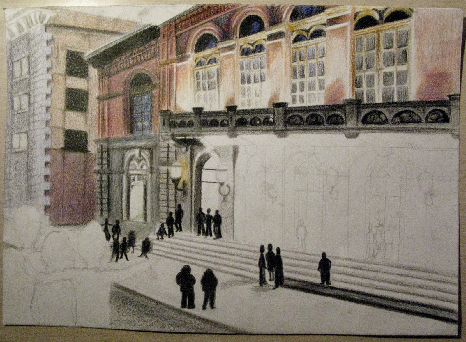
From here onward I kept on working on the doors below the balcony and after that I started doing minor fixes on the background building and I filled in the dark characters on the far left bottom corner, making the edges of the facial features blue to relate to the other smaller work, which I thought was quite necessary even if it doesn't fit in the work. And voila! It was finished. 


Here is my scanned version of the work, and I guess I could say that I am quite happy with this work, especially considering that I really stepped out of my comfort zone to draw a building and a scene like this. It was a challenge, but I learnt a lot from it, such as getting color values right and getting my proportions right, keeping the vanishing point in mind. 


And there we go. Only one more work needed in the middle which I started working on this week. However, I do think the three works will fit in together well and I cannot wait to get them ready and presentable for their receivers. 

Now it is time to break out the A3 and start working on my poster, which I am especially excited to start on because it is directly associated to my future plans, doing illustration. I love designing letters and doing projects like this because they are so freeing for the mind and soul, allowing your creativity to run completely free.  


Okay, so I am very aware of my plan for this poster but I just couldn't help myself to make a few alterations after inspiration struck me. I'm taking references of Bob Dylan in the Last Waltz for this entire project so I wanted to get his whole 'look' right as well so I found a great reference picture for him and I decided to alter his hair into something more surrealistic such as below - squiggles. I think these will look completely rad with the right colors. I also wanted to do this western kind of typography to write out his name on the top, I'm not sure why, I just thought that it would fit well with his old-timely background. 


I'm still going to include a standing Dylan in the front, the singing Dylan in the background is just going to be like a close up of him, and the foreground will be a 'stage' for him. So I'm really just adding a face in the background, I think that will come out quite well with a little more work. 

Alongside my Dylan project I started a self portrait with conte crayons in my art class, we were assigned to draw 'selfies' but I did not like the idea of drawing myself smiling so I decided to do this expressionless representation of myself. 


 In this work, I'm using only three pieces of tools; a black and a white crayon and a blending tool that is essential for getting the values right. These crayons are extremely forgiving to the point that I feel like I'm almost cheating because it's making my progress so easy and almost even thoughtless. I kind of like them and hate them, I do like the challenge with graphite pencils where you can't add white in anymore if you've made it even slightly darker already, with contes it is almost too easy to put white back in. 

 I really enjoy working on hair, I started working from the left to right because this medium smudges extremely easily and requires more attention to avoid smudging than ruining your work. Anyway, I found this working with hair a really easy task and enjoyable to work on because I got the exact texture I was looking for with the right amount of detail that was easy to mold with a little help from my smudge tool. 


 From here onward I work my way down from left to right again, avoiding as much smudging as I can. The most difficult part in this work I found was getting the expression right on the face, because it is quite expressionless and that can be hard to obtain at times at least for me at this point. Below you can find my just about final representation of this work, I think I will do a few more final tweaks to the face here, such as the lips and the nose, just to make sure all the shadows and values are correct before bringing it back to my art class. 


This work is quite large itself, it is 19 x 14 inches which I think was nice. I enjoyed working on a larger surface for a change since I usually work on A3 at the largest (for the exception of my last art class in the fall of last year). This work took me about two weeks to finish all together working on it for an hour and a half five days a week, which wasn't too bad I'd think I can be much slower than that. 

A productive finish for a productive week! I'm making good progress for my portfolio, with only two 2D works to finish and one 3D that I'll start working on on the Christmas break (yes, I've planned this already). Tune in next week for my progression on the Dylan poster!

Sunday, November 30, 2014

At the Show: Pt II


This week I started working on my second work in my series of three works as I mentioned I would in my last post. However, I made some changes: I settled on another sketch to base off onto my actual work that is different from the one I posted last time. I just thought it was better suited for what I was going on and there it is below, a rough sketch for what I'm about to translate onto a nice piece of paper. 


As a medium I am using color pencils again to keep it constant, but I am using my water soluble colors instead without using water (because I have more color selection with my water solubles). I'm going to start off with the 'background' building and then work my way from left to right, to avoid smudging. 


I really did feel like I truly messed up the background building and I decided to come back to it after I finish my focal point. The most important thing here was to get the color values correct, which was quite difficult for me this time since first off, I am coloring a building and second off I'm still very much a rookie with color pencils. So, no promises on the outcome. I did very much enjoy doing the windows on the top of the building and playing with colors and such, I found the lighting to be very fascinating and enjoyable to work on. After finishing the windows on the top I work my way down to the lining and then down to the doors under the windows. 


Above you can see how I've started working on the arcs that'll become doors and I've added a few people, desperately waiting to get into the Dylan concert. Ha-ha. I was contemplating on making the people waiting to get in colorful, however I took artistic liberty to just make them black, perhaps giving a sense of darkness and contrast even. The main characters on the left will be dark too, so I thought it would be appropriate to make the other people dark as well. 


And here we go. One door down and three to go. I found these doors and arcs quite easy to manage as well, requiring less attention than the windows, if that's possible. The only issue I am having are the color values, I can't seem to get the colors I want, I should probably take some lessons from my other art-affiliated friends who are more into color than myself. 


Unfortunately, this was all the progress I made this week I've been slow since it's been a hectic time in school and finding myself good college options and so on and so forth... High school seniors will know what I am talking about and above all, I am behind on all that stuff. Anyway, I hope to finish this work by next Sunday and be starting on the final piece of the Dylan project. 

'Til next week!

Saturday, November 22, 2014

At The Show: Pt 1

This week I have something completely new and different to show you guys! A few weeks back I came up with a entirely new idea for a project through a small push from outside influences in the family.

 Tomorrow evening I am going to go witness the spectacle of one of my greatest influences Bob Dylan. I have been enormously excited to see him live since I practically live by his words and genius music he has produced in his time and I can only count my lucky stars that I even get to see him live in my lifetime. Anyway, it gets better and this is what really kicked off my inspiration for the project I started working on a few weeks back: the show is located in an old, majestic theater filled with richness of color and atmosphere and MY idol is playing there  - the perfect venue for an artist of Dylan's magnitude, I believe. And what really is the cherry on top for me is that I get to go there with the people I love and so I wanted to make something special for the event that would really show how much this meant for me and create something that would capture the moment or the day, if you will.

So, I started brainstorming for a few hours whenever I had the spare moment to work on this since I had initially thought that I would just make this piece and not include it in my portfolio for college. However, I came up with this three-piece idea that I believed would give me a little challenge and at the same time would bring out the best of the event we were about to see. I scribbled ideas for three different works that would tie in together; two small ones (A4s) on the concert itself and one larger (A3) that would be my design for the 'concert poster' for the event which I thought would be extremely handy for my portfolio - showing my ability of illustration since it is what I am planning on studying in the near future. 


Above is my scribble for the poster, I picked out the "Academy of Music" logo to fit in with the poster which is essentially trying to portray some of those glow light signs, not looking like it in my sketch but hopefully will in the finished piece. I've made a plan to start working on this one only after finishing the two smaller ones. This piece would be plotted in the middle of the two smaller pieces if you can only see it in your mind's eye. 

The first of my two smaller works on A4 sized papers has a few different ideas that I haven't really picked out yet but will have to after I finish writing this blog post since I finished the other smaller work and will get into it very shortly.  


The logic behind the three characters is to portray my 'posse' going to the show, because I am dedicating this project to them and am hoping to give a good quality copy of the original to them to show my gratitude of the evening to come. The one above is more of a 'Wizard of Oz' type of idea with surrealism mixed in with the big moon in the background, I sort of just let me mind go on this one, who knows maybe that'll be the winner. 


Here's idea number two for one of the smaller works, a more boring option but giving me more liberty to study drawing buildings and symmetric figures which I think I would enjoy quite a lot. 

Lastly, my original idea for the first small piece is below, the inadequate representation of the Academy of Music (sketched in about two minutes just to get a general idea) featuring the three characters again finding their way into the building to see the spectacle. 


I quite enjoy this one too but I have a fear that it will not work out quite as I wanted proportional-wise. So I might just rule that one out and go ahead with the second sketch I made. 

What I did decide on already two weeks ago was my second small work, quickly scribbled below. 


It took me awhile to figure out the medium I wanted to be working in, I wanted to have color but still retain a certain darkness that you have during a concert and especially such a majestic one and I was actually between using ink and watercolor or colored pencil and graphite. After a few days on contemplating I decided to go with the colored pencils and took myself to a few art supply stores and bought some high quality VERITHIN Prismacolor hard thin lead pencils and starting working with these - mind you, this was the first time I've used color pencils to produce any kind of serious work other than when I was a child. For that, I was a little skeptical about using colored pencils since it just didn't seem too professional but I got used to it. Well, pretty much. I still prefer charcoal or graphite as a medium. 


I started my work from the sides, building up the pillars and the balconies, then working my way through the ground floor and up to the stage and finally got to the curtains. I really wanted a rich color red for my curtains and it really took quite a bit of honing and experimenting to finally get that color, of which you can see more as I go along with the process. 

I did quite a bit of research on different types of theaters after doing my preliminary sketch and did a mix on all different types of stages, curtains and balconies to construct my final layout, which I thought was nice because it resembled the Academy of Music but had its own twist to it anyway. 

After working on the sides and the stage I began working the rest of the curtains and started filling in the black in the characters.


I left the cone of light as the last part to make sure I get it right, I'm leaving the hardest part for last and doing so it makes it easier for me to blend in the lighter red that the light creates on the curtain and also gives me time to hone in on the last ideas on how I'm going to illustrate Bob under the spotlight. 


The next part I wanted to do was a little shadow of light on the characters' faces, only later did I really think that blue may not have been the greatest choice but I thought if I blended it in well enough to just give out a subtle blueness it would all pull in together well. 


And la de da! It is finished. The cone of light came out quite well in my opinion, but only below can you really see a correct representation of color in the work - I'm not satisfied with the colors I get from scanning the work. 

Just to sort of pull it all together in the end of this work I'd like to note that as for a first work working with color pencils this was quite challenging and exciting for me as for the experimentation - some aspects came out better than others. I especially don't like how the pillars came out I think I could have worked harder on those to get the colors correct but hey, I also had a limited palette to work with so I did best with what I could find. 


Above is my from 'plan to work' representation; all in all I am just about satisfied with the outcome and I do honestly believe the next two works will really pull it in together. 

As for my next work I will be doing the second smaller work before heading onto the poster work, which will require more thought and planning than these two. 


... How do you think it'll come out? I'm hoping for the best...

Sunday, November 9, 2014

Allen & Keaton: Pt 2/2

This week I've made plenty of progress in the development of my portfolio for college by sheer determination only; I've finished my Woody Allen and Diane Keaton portrait which I'll be expanding on in just a few lines. I have also been making plans for new and exiting projects - including  sculpture, I am not even kidding - and I have actually finished quite a few works, unfortunately all within in school art courses which I haven't been able to document like I usually do with all my works.

 Nevertheless, when I get these works into my own hands I will definitely post them for you to see here just to stay updated with the progress of my portfolio - something I need to be thinking about at all times so it'll be a good reflection for me as well. By the time the end of January comes I'm hoping to have a developed portfolio to show colleges as well as my reader base right on this page here. We have that to look forward to!

Before getting too ahead of ourselves, I'll get back to my most recent portrait work. Below you can see where I was left off on Monday this passing week; today we will mostly be going through the development of the female character, Diane Keaton. 


Last week I managed to just about finish my Woody Allen - the image looks significantly grainier than  it looks to the naked eye, a dumb excuse I am aware of but hey! I'm still quite new to the whole working with pencils medium. Especially with no blender tool I'm still working on finding the true smoothness that a graphite work requires. 

I apologize for the yellow nature of some of my images - I often work during the evenings and my lighting is poor at the moment making good pictures difficult to take and I can't afford to stop working until the next day to take a picture and make progress after. 


Here you can see I've started working on the values of the female character's face. I start with a 2H pencil, working my way towards darker values instead of blocking in darker and lighter values haphazardly. 

I'm going by the same principles as with the male character so instead of repeating myself I'll just jump ahead a few steps where my values on the face are obtained and I can start working on finer details such as the hair. 


...And here we go. I've made a good start on the hair work and began working on detail on the face such as the teeth, nose and sunglasses. The face of this character was quite painless, easy and quite enjoyable. I haven't done much drawing of hair so this was a nice experience working on such a thing and I felt like it may not be absolutely perfect but quite often I'm not aiming for the unbelievably realistic representation of images - though maybe I should. 


From here onward I keep working on details, values and the process of making the work look smoother overall. Something that struck me as being odd was the proportion of the two heads; the male character has a significantly smaller head than the female character which looks odd to my eye as though the woman is almost a giant in the work. However as the truth lies the male just has a extraordinarily small head - I mean I guess it could be, anyone who has seen Woody Allen in any movie can say that he is quite the compact man. 


After a few evenings of work, I've produced the following on the right. The clothes are always a taxing job for me, getting textures right can be a real pain. However, I concluded that I don't want it to be the focal point of the work so it can be a slightly bit  more vague than the rest of the work. 

Below you can see a closer take on the face of Diane. I used the 2H pencil a great amount in this work, I feel like it is a great tool for making surfaces smoother and it makes working on values much easier than diving straight into darker shades of grey. 


Just as a recap and to round off my post before showing the entire work in all its entity I thought that I should do a few reflections on Woody. What I do feel like I failed to do was to smooth-en out his face, I am not happy with the graininess but in my defense Woody was much like my 'dummy' for testing out new ways of drawing and shading that perhaps I should have done before working on him. What can I say, I have little patience for such exercises. I need to get straight to business. 

Another challenge in Woody was the texture of his jacket - not at all that it was a difficult pattern or any such thing but I found it difficult to make it look real and I really do still feel like it didn't quite work out as I wanted to. As I said before, I have little patience for working on textures that are on large surfaces and I still need to hone on those skills, and I feel like this was a good exercise to work on those skills. 

My final reflections on this work in its entirety would probably be that I quite enjoyed working on it; I enjoy the interaction between the two characters and doing something different I haven't really done before. Of course I have a few regrets in this and that but it was all a learning experience and I can now say that I have one less work to do for my portfolio. 

Oh, I also added a little detail to the background to offset all the white, to represent something like.. trees? That's for someone else to decide. 


That must be it for today. I mean, it is my Sunday and I have to get another project started so that I have something to talk about next week. I can honestly say that I am ready for something new as much fun as this latest project was. So be ready to tune in for that next week! I think I am going to start posting on Sundays again.. just to keep the routine up for old times sake. 

Monday, November 3, 2014

Woody & Diane: Pt. 1/2

What a gorgeous, though slightly chilly fall day it has been today!

As most of the county knows, tomorrow the midterm elections are taking place in the good old United States and all the over 18 year-old's should be getting ready for voting tomorrow much like I should. But I am not unfortunately due to my own stupidity of missing the registration deadline by two lousy days. This newly turned 18 year-old will not be fulfilling her civic duty this time, oh well... 
  
Instead of moping around about it I've decided to utilize my time and my day off tomorrow to make some good progress for my portfolio. I started on a new project, a portrait in fact, with Diane Keaton and Woody Allen - a couple that used to be seen quite often in Woody Allen's productions. See, I am a humongous fan of Woody's work and I find it difficult to fathom how someone could not like him led alone not know him! He is a complete classic in all his glory. 


So, on the left you can see my 'model' picture though I decided to bring the two closer together and make a few alterations here and there just to keep it interesting. Below you can see I began my preliminary sketching, getting the basic figure down before blocking anything in or making any further alterations. I actually began this work a few months ago before I got too busy to do my art so this week I've been getting back to it and made quite a bit of progress for the short whiles I get to work on it. 


After drawing out my preliminary sketch, I decided to begin on the male figure, Woody, which I later realized to be a dumb mistake since I am right handed and working from left to right might later smudge the character on the right when working on the left side of the work. This issue is of course resolved simply by using a blank sheet of paper to cover up the finished parts of the work so that my hand won't smudge while working. 

I start my work by shading in the basic values that I'm in need for the different parts of the image and slowly start shaping in the broader details before getting into the nitty gritty. 


As I said before, I started working on this piece a few months back and I actually only began working the shoulders and the clothing of the character on the right, which I want to fix completely now since I feel as though I didn't do a very good job at it. I decided to start on the face this time instead and work my way down from that and attempt to make fixes later than sooner. Ha. 

I guess at this point while I'm at it when I started working on this piece I decided to boycott the smudging tool completely since colleges do not like to see the use of them in students' portfolios and besides, I rather learn blending values the hard way rather than starting with 'cheating' - if you will - from the git go.  


The next stop after blocking in my general values is to start working on detail and darker values, as you can see above I've colored in the glasses and used stronger colors to create more contrast and depth. However, I still need to create more contrast and smooth-en out my colors by filling in with my 2H pencil, a useful tool for such a hard pencil. From here on I keep on filling in the colors, especially in the hair area, which will be my next task. 


On the left you can see my current work desk, it's quite small and uncomfortable compared to my old, big wooden desk that was more like a work surface instead of a desk - man, I loved that thing. However, I have my jam working ensuring complete inspiration and motivation for hard work on my latest project! 


Below you can see a close up on the right character only, since we are not focusing on the left hand character just yet. You can see that first of all I've darkened the hair on the character along with adding and distinguishing highlights from which we can see the curly nature of his hair. Second, I've made the texture of the face more smooth and even, despite the slight graininess to the bottom of the face which I will have to work on further. 


 What I do really need to fix is the clothing of the character. That cannot stay the same way much longer - as it will not. It's funny, because at the moment I actually do feel like I'm getting more of a Lou Reed vibe instead of a Woody Allen, probably indicating that I should look closer at the original image and start reworking some parts to make it look more correct but knowing myself I only like the fact that it doesn't look exactly like the image, as long as it looks real.


I hate to say it, but that is all that I have for the moment. It is probably the best anyway, my posts are getting longer by every post, I should learn to restrict myself. All I can say is, stay tuned in to see more progress, I will be working hard on this project and the ones too come so I will probably keep posting with fewer breaks than I had let myself do before. 

Thursday, October 30, 2014

Fresh Territory and Johnny D

Hello my friends!

I do indeed acknowledge that my posting has been quite rare if non-existent for the past few months, but I am quite ready for a fresh start now. See, it is not at all like I have not been busy or any funky business as such but I actually have experienced a great change in my life: I packed my belongings, said my goodbyes to several beloved friends and just about picked up and left all the way to the other side of the world - to Pennsylvania, United States. Now most of my readers probably know by now that I am from a small country called Finland, that most people around here don't even know where it is or what the people who live in such a country are called: Finland-ese, they said. 

Moreover, now I live in the United States as I had always hoped for with my beloved family and I am rapidly moving towards my goals of getting into a well established art college in the hub of illustration - Philadelphia. 

Now, even though I've been extremely busy just getting used to counting pennies, nickles and quarters I have indeed gotten a few projects started. I have not yet finished Caminito (actually I started working on it again just last night) that featured in my most recent post for you see I had to pack my computer away for shipping and I was only reunited with my computer and tablet about a week ago. What I have done is a request work for an old dear friend from school in graphite which I will get into for you today. 

So. What was my requested project, you ask? Johnny Depp. Yes, I wasn't too happy about it since of course everyone knows what Johnny Depp looks like and if I were to mess up EVERYONE will notice it. However, she seemed happy with it so I won't complain it was for her after all. I started with a image of her choosing and roughly sketched out the figures I was dealing with, breaking down the whole photograph into lines and circles. 


Here we go. The outline is established and I have started working on the loose, woven hat Depp is wearing. I can't say it wasn't a struggle trying to make that hat look woven - at least in any credible fashion - but since it is not the focal point in the work I thought I could leave it more blurred off in order to limit the 'eye attraction' factor, if you will. 

After finishing the woven hat, I begin to work my way downward to the forehead and eyes as well as making sure everything is proportioned correctly checking my image as I go along to make sure my values are correct. For the forehead, first I get the shade of grey I'm in want of and then start working on the shine and shades that Depp's bone structure as well as his hat creates.


 Here we can see that I have begun working on the right eye and started coloring in Depp's dark, almost black, hair. I also worked on the eyebrows making sure that my pencil stays nice and sharp to obtain that 'hair' texture. It was nice and easy working on Depp's eyebrows since they were bushy and dark, making it easy to find the correct value and opacity of...eyebrow. 

I don't want to drag my explanations too long because it is mostly just finding correct values and keeping the 'Depp' look, which is difficult to distinguish at the moment.


As some of you may know, eyes are always difficult to work on since it can be a taxing labor to try and make the eyes look 'real' per say and keeping them in line with each other. I had great difficulty finding the correct perspective with the eyes on Depp since it really did feel like they were an unmatched pair, even in the photograph itself which I do not have at the moment, unfortunately. I kept working on the eyes for a week straight as I continued working my way down Depp's face and I still do slightly feel as though they would need more work but what can I say, sometimes you just run out of time and works will always have some imperfections, right?

Unfortunately I was too dumb to actually take more pictures of my process such as with the mouth, chin, hair, mustache etc but all in all I felt as though it went quite smoothly: I started out with subtle colors and worked my way towards darker colors in order to create that contrast that is needed in any work. 


And here we go. A snapshot of the pretty-much-finished work. Off to the balcony and we are finished and ready to showcase to the customer!


Above is a snapshot from the balcony, a work ready for it's coat of fixative before it's final photo shoot for portfolio purposes and to be sent to my customer. 


And voila! As for my first graphite pencil portrait of a celebrity it was received quite well among my viewers. This portrait took about a week and a half of work to finish with my limited schedule, but I do believe I learnt quite a bit from the experience. It was a pleasant change of paste from the constant work on the computer, something I felt like I really needed to do to get away from my latest, extremely colorful piece of work. 

What I found difficult to obtain was the texture of Depp's skin, somehow he has very grainy skin in the photograph I used and I found creating that effect being quite challenging. You can see my efforts on the right cheek, but mostly as I tried to create that texture it came out as blotchy, instead of grainy. Perhaps I need more practice in that department; however, otherwise it was a pleasant change to draw wrinkles and signs of aging on an individual, something I haven't done or explored upon before. 

As for today, I thought I would only explore on this work and leave my other beginnings of several works for another day just to keep this post within a readable length. So tune in till next time! I will be picking up on my work nowadays since I have until February 1st to finish my portfolio for the most prominent art colleges in the area, a pressure that I have found to be both positive and negative.